

Decorative Images
I want to visit images again to review a couple of common issues I have seen on sites. These issues are easy to recognize if one simply ties to adopt the mindset of a blind or vision impaired person.
First, a blind person relies on a screen reader to tell them what is on the web page. For regular text, it can read the text to the user. In fact, the color of the text has not meaning to the blind person. You could in theory have white text on a white background and the screen reader would still read the text to the blind person even though the average sighted person would not see anything at all. Why is that? Because the screen reader reads the HTML that builds the page, not the page itself. Color contrast for text comes into play because of sighted people who may not see colors the same way you and I do (in fact, I may not see them the way you do) and therefore color should never be used to emphasize text.
Blind people using screen readers do not see images either. Maybe someday screen readers with artificial intelligence built in may be able to interpret an image and tell the user what the image is about. In fact, research into image recognition has been underway for several years, but screen readers do not have that capability yet. Therefore, consider the image shown below.
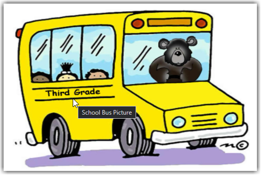
You might say that it is an image of a school bus as the person in this site did as shown by the current alt-text. Perhaps you might even say it is an image of a cartoon school bus. Maybe you would even go as far as saying that it is a cartoon image of a school bus being driven by a bear. It might even be referred to as a cartoon image of a school bus driven by a bear and taking small children (3) to the third grade. In fact, if I were to right click on the image to view its properties, I would see the following.
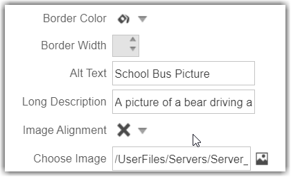
First, I see the alt-text: School Bus Picture. This is what we saw when hovering over the bus with the mouse. However, notice that there is also a Long Description that says: A picture of a bear driving a school bus. The problem is that this is not the proper way to define the long description property. I covered this topic earlier in the blog post:
Tale of the alt, title and longdesc Attributes
But the real question here is not where to place this information, but whether any of this additional information is important in the first place. What I mean is you need to ask yourself whether the image adds to the understanding of the content on the page. If this image were part of a children’s e-book about the bear that takes children to their school every day telling them stories along the way, then perhaps it would be important to the content on the page. However, in this case, my opinion is that it does not add to the understanding of the content on this school page about third grade curriculum. Therefore, this image is simply decoration, or as I tend to refer to it, ‘Eye Candy’. It makes the page ‘pretty’ but does not affect your understanding of the page content and the vision impaired person would not understand the page content any less. Of course, some would also say that this is a ‘grey’ area of the rules because the image could be seen as providing atmosphere to the page, in this case a more jovial or friendly atmosphere rather than a just cold text. For now though, I am going to suggest that the question, “Does this add to the understanding of the page’s content?” be the governing rule.
When an image is decorative, it still requires an alt tag in the HTML. However, that alt tag is set equal to an empty string as shown at the end of the following figure.

At the current time, you must switch to the HTML view of the page content to first remove any current alt and title attribute associated with the image tag (<img>). Then you must manually add the alt=”” text to the image tag (<img>). Then save and publish the page.
There is one problem currently which SchoolMessenger/Presence is aware of and will be working to fix in a future release. If you or anyone else were to open the page and right click on the image to view the image properties, when you close the properties window, the alt attribute just added above is removed from the image tag. Therefore, if you do need to edit the image properties, you must also go back into the HTML to add the attribute: alt=””.
One additional concern. Make sure the images you use, if you did not create them yourself, are in the public domain for general use. Notice the small circle in the lower right with the ‘c’ in it. Was this just part of the image art? Or was this really a copyright indication?
Gratuitous Images
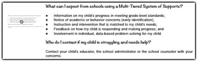
I call images that are used to simply replace text, gratuitous images. There usually is no reason to replace the text with an image of the text other than to support a fancy font. But unless the font is related to an organization’s logo, is it really necessary? The following example was taken from a page where the image was used in place of a page header, it even had header tags (<h2>…</h2>) around it. Now when the headers are read to the blind visitor to your site, they still cannot read the text in the image. But perhaps the real question should be why was an image used instead of text for the header in the first place? Does the font style really add anything of significance to the understanding of the content, does it represent the font used by a corporate logo or was it just ‘eye candy’? If the later is true, just replace the image with the text. If the image adds to the understanding of the content or is part of a logo, then make sure that the alt-text duplicates the text in the image.

But what if the image containing the text was clearly used to avoid typing in the text as shown in the following image. I do not believe the fonts used here significantly add to the understanding of the content. You might argue that the diamond shaped bullets used in the list are not part of the HTML definition for an unordered list. However, you have these options:
<ul type=disc>
<ul type=circle>
<ul type=square>
<ul type=none>
Overall, there is no reason why this image could not be replaced with text with no loss of meaning and therefore be accessible to everyone.
Color Contrast
I’ve talked about color contrast many times in the past and recommended a tool that can be used to test color contrast: Colour Contrast Analyzer. However, one thing that we did not talk about was when you test your color is just as important as the colors themselves. What do I mean by when? Well take an image such as the one shown below. Specifically, look at the orange text on a blue background in the lower half of the image. Perhaps I knew that the color defined in the HTML for this text was RGB(214, 138, 81) on a dark blue background of RGB(4, 30, 66). This would result in a contrast ratio of approximately 6:1 which more than meets the 4.5 requirement which is the minimum contrast for smaller text.

However, colors on an image are often dithered to reduce the sharp edges and round out the text. When you look at a magnified portion of the text, you would see that each character actually consists of a range of different colors and depending on exactly where you sample the color, which pixel you ‘hit’, will calculate a different color contrast ratio. For larger text, this effect is minimal and even for colored text on white background it can generally be ignored. However, when text, especially color text is placed on a colored background, the effect can be substantial especially for smaller fonts or fonts with very thin lines. So instead, you might actually see something like this next image at the pixel level.
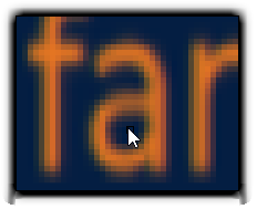
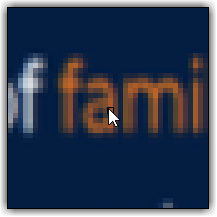
Furthermore, the problem becomes even more extreme when the original image is resized to a smaller version of the original as shown in the following image

In this 50% reduction version of the image, the same text area shows exasperates the effect of the dithered text with portions of the letters such as the legs of the letter ‘m’ clearly having reduced contrast.
So, what do you do? Well, if you made the image, you could try changing the colors, the font, or even the font style (bolder text). Of course, you could always ask yourself why this text had to be created as an image in the first place and simply replace the image with plain text.
Another ‘quick’ way to ‘guess’ at whether the color contrast is sufficient is to step back from the screen so your eyes are at least two to three feet away. Then ask yourself, do the foreground and background colors make the text harder to read. Try this with the image above.
If you got this image from someone else, say a different department or even a different organization, you could ask them to create a more accessible image and send it to you to replace the current one. But keep in mind that it does not matter where you got the image (or a video), if it does not meet ADA standards, you are still responsible for it since you posted it on your site pages. On the other hand, if you simply link to some other site that does not meet ADA standards, it is not your problem, but theirs.
That is it for this time. Next time I will share a second free tool that can help you select colors for your fonts and backgrounds that meet ADA requirements.