

Not everything is important
We know there is a lot going on at your school, but not everything is important enough to be on the home page. The net effect of putting too much stuff on your home page is like looking at your email inbox after coming back from a two-week vacation. You do not know where to begin. You do not know what is important. You cannot focus. Your head may even start to hurt and you quickly leave the site to go somewhere else.
How to Minimize Information Overload
Headings help organize information. When a user sees a heading, they know intuitively what to find in that section. Upcoming Events, Recent News, and Principal’s Message were chosen for a reason. Recent News should not be cluttered or replaced with other content areas prompting for donations, PTA membership, or even contain lengthy columns that echo your social media feeds. There are buttons at the top and bottom of each of each school pages for social media (https://wordpress.ocps.net/presenceblog/does-your-school-use-social-media/). It is also why the number of Recent News items is limited to three items.
Similarly, the Principal’s message should be just that. Do not replace it with other school notices, school hours, school address, school phone numbers, policy statements such as dress code, or even worse, repeating recent events.
Likewise, the rotating banner is a way of calling attention to specific news, celebrating recent events, or other special notices such as: “Register Now for Next Year”. However, each banner image should be mostly about the image related to the topic. It should not (according to ADA-American Disabilities Act) contain a lot of text that screen readers cannot read leaving the visually impaired literally in the dark. Text describing an image must be in the Alt-Text field. However, if you have a lot of text to convey, put that somewhere else. Where? If it is a future event, put it in the description field of the Calendar event. If it is recent news, put it in the News Content Page. It can even be its own standalone page under the Home page, but hidden from selection. To reference this additional content from the banner image, include the page URL in the image properties. Also make sure to set the Action on Image in the banner settings to Click to Open URL in New (or Existing) Window.
No Shouting
Use of all caps on a web page is the equivalent of SHOUTING! Sorry, just don’t do it. Similarly, using many different typefaces, type sizes, and type colors is not only distracting, but makes the page look like a Carnival poster rather than a serious school page. That is why we ask you to use the Paste Plain Text option when copying text from other sources such as Word.
Don’t Be Annoying
Do not put a lot of animated images on the page making everything on the page appear to move at once. It can make the viewer dizzy. Do not have videos or sound automatically start when the user opens the page. This is disturbing not only to the viewer, but also to others sitting around the viewer in an open office environment or other quiet area. If you want to have videos or sound on your site, make sure the user has a way to start and stop the playback using either the keyboard or the mouse (ADA rule).
Format for Readability
-
If your content requires a large amount of text, break it down into smaller paragraphs perhaps with headers at the start of each section (like this document). Use H1, H2, H3, etc. tags as a nested hierarchy of headers if needed.
-
List action items as bullet points if they are independent of each other or numbered bullets only if they must be performed in a specific order such as steps in a task.
-
Highlight key terms. I often bold field names or commands and italicize specific values the user should enter when providing instructions. Highlight means bold, not another color or underlining.
-
Do not use TLA (Three-Letter-Acronyms) without defining them first. You may think you know what a TLA means, but the reader may have a different idea. For example, it took me months to stop thinking of DOE as the Department of Energy rather than the Florida Department of Education.
-
Use white space to help make reading ‘feel’ easier.
- Use Word to check the readability of your text.
-
Copy the text to Word. Do not worry about formatting other than paragraphs.
(First time: perform steps 2-10)
- Check File in the Menu row.
- Click Options in the left column
- Click Proofing
- Go to the section: When correcting spelling and grammar in Word
- Check: Check grammar with spelling
- Check: Show readability statistics
- Select Writing Style: Grammar & Style
- Optional: Review Settings
- Click OK to exit out of Options
- Select the Review ribbon and click Spelling & Grammar
- When the spelling and grammar check are complete, you will see a screen like this:
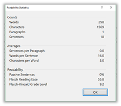
In the above sample (no, I am not going to tell you which principal’s message I used), the Flesch Reading Ease value is 55.8. This value ranges from 0-100 with 100 representing the easiest to read. Likewise, the Flesch-Kincaid Grade Level indicates the average number of years of education (9.2 in this case) the reader needs to understand the passage.
Well, I hope these tips started you thinking about way to improve not only your home page, but also your entire site. Keep coming back for more posts on managing your web site.
PS: This document had a Reading Ease value of 62.6 and a Grade Level of 8.4