

One of the more common compliance issues with ADA (Americans with Disabilities Act) is also one of the easiest to fix. Color contrast in relation to the text on the background requires that the text be easy to read by all users who access your website visually. Color contrast measures the difference between the font color and the background color on which the font is placed. The rule is quite simple:
- Text consisting of a font that is greater than 14 pt bold (19 px) or 18 pt normal (24 px) must have a 3:1 contrast ratio with the background on which the font is displayed.
- All other smaller text must have a contrast ratio of 4.5:1.
How do you calculate the color contrast between your font text and its background? Well, as I mentioned several times in past blogs, you do not need to know how to perform the calculation. There is a free tool that you can download and keep open on your desktop at all times so you can check the color contrast of everything you create. It was created by The Paciello Group and can be downloaded from this URL: Colour Contrast Analyser.
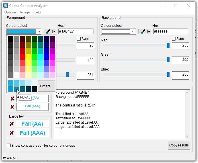
But if the color contrast is not sufficient, how do you fix it. Well, of course, you could try randomly selecting different colors, shades, hues, or tints of the original color until this tool calculates a satisfactory contrast ratio. For example, suppose the Colour Contrast Analyser was looking at a light blue (Hex: #1AB4E7) font on a white background (see image below). The initial colour contrast ratio is 2.4:1 which is too low even if the text was larger. You might think that the light blue on white looks good to you. However, you are not everybody and some people have more difficulty with low contrast colors than others. Therefore, the Americans with Disabilities Act had to create a set of rules that were testable and verifiable to ensure contrasts that most people would find the resulting text to be easy to read against the background.
One way to ‘fix’ the problem is to click the dropdown arrow to the right of the box that displays the color which opens a grid of different colors as well as several different tints (adding white) to the base color and shades (adding black) to the base color. Because we want to increase the color contrast, we would perhaps try some of the shades in the second row where the arrow in the following image is pointing. In the image below, the mouse is pointing to the second shade in the second (‘Shades’) row which has a hex value of #1487AE.
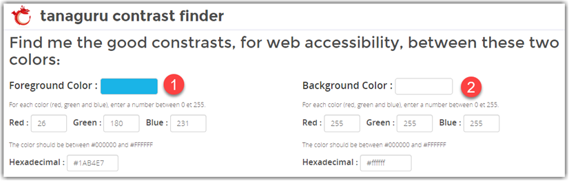
However, even this shade of blue is not dark enough to contrast with the white background resulting in a value 4.1:1. Good enough for larger text, but if the text is smaller, it still falls below the 4.5:1 requirement. We could go back to select the middle box (#0D5A74) which results in a great contrast of 7.7:1. However, that may be too dark. I am not going to go through the trial-and-error steps here of going back and forth between lighter tints and darker shades until you find one that satisfies the 4.5:1 rule without deviating too much from your original color. Rather, I am going to introduce you to a second tool that can help you find a satisfactory color without all that trial and error.
The tool that I found is called the Tanaguru Contrast Finder. This tool, while free, is not something you need to download. Rather just go to the Tanaguru home page for the contrast finder.
This tool’s home page lets start by specifying both the initial foreground (1) and background (2) colors. You can specify these colors either using the decimal values of the RGB color definition or you can enter the hex value of the color
Next, you can select the minimum colour contrast ratio you must meet (3). If the text is smaller, select 4.5 as shown below. For larger text, select 3.1
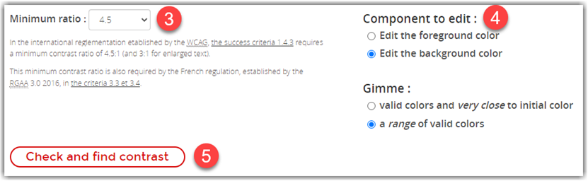
You can then select which color you want to change (4). In the case of regular text on the web page, you generally want to keep the page background color consistent across all of your pages. Therefore, I would choose the Edit the foreground color option.
You can also ask for colors that are very close to the initial color or a range of valid colors(4). I would in most cases go with a valid color very close to the initial color unless the contrast of the initial colors is too far from the ideal value in which case I might ask for a range of valid colors to pick from.
When all of the settings (1-4) are complete, click the Check and find contrast button (5). This is where the magic occurs.
After clicking the Check and find contrast button, the bottom half of the page is filled with possible colors that meet or exceed the color contrast you selected.
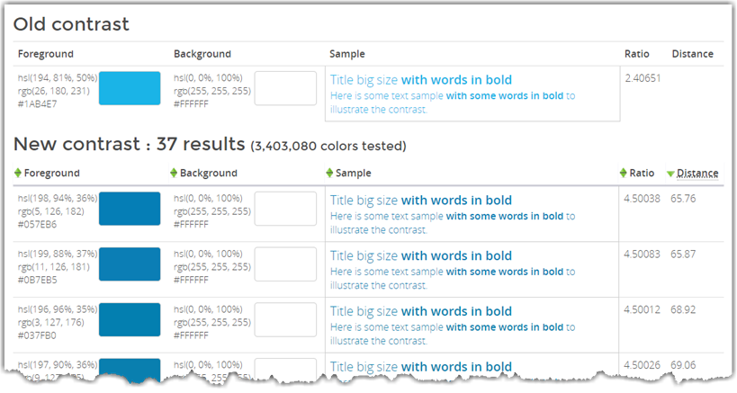
First, it shows the original foreground and background colors to give you a reference. To the right there is a sample of the text so you can see what it would look like on a web page followed by the calculated contrast ratio.
Beneath the original colors, you see the possible colors the algorithm has selected. Even if they all look a little similar to you, the actual RGB values displayed in the leftmost column show that these really are different shades of blue. Note that the ratio column shows a calculated ratio of 4.5 or greater for each of the color combinations.
What I find instructive in training your eye to spot questionable color contrast text is to focus on the sample text from about 4-5 feet away. No matter how good your vision may be, you will often see a significant difference between the original colors and the selected colors, especially in this case.
Another example is the following image fragment from a web page I ran across. The first thing that my eye picked up was the green text on the white background. Indeed, this combination is only 2.5:1. However, not as obvious to most web page editors is that the red used in this table also has a low contrast to the white background. While it is better than the green, it still is only 4.0:1 which is below the required color contrast ratio of 4.5:1.
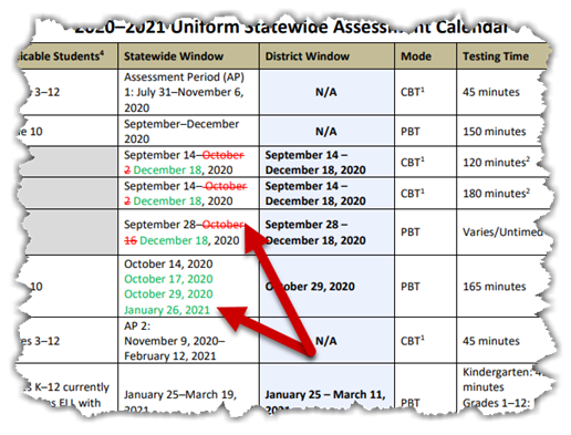
In fact, this shade of red is often picked out of a grid of colors as shown in the font color grid within the editor. As shown below, a pure red that also has the RGB value of (255,0,0) may seem at first to be a good choice because it may appear to be a bright red on a white background. Note, however, that bright colors often have poor contrast on a white background, but may work fine on a dark background. Keep this in mind: the color select dialogs in almost all cases have no idea what the background color will be. Therefore, it displays a range of colors, some of which may work with your background color, and many that will not. It is your responsibility to determine if the resulting color contrast with the background color is acceptable.
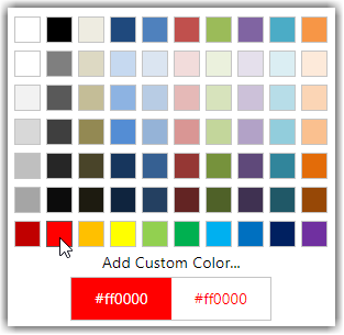
In this case, the darker red to the left (#C00000 or RGB(192,0,0) will actually provide a good contrast with white resulting in a contrast ratio of 6.5:1. Don’t even get me started on orange on white. I have a prior post on that issue and while we should be proud to be part of Orange County Public Schools, that does not give us special permission to use orange text on white.
When you have text on a colored background such as the image shown below, the situation is much more complex because you can actually tweak both the font color and the background color to achieve the desired contrast ratio. (Yes, even text in images must meet the color contrast rules stated previously.) In this image the yellow on blue text has a ratio of only 2.1:1, the white font on a blue background (or blue text on a white background) is a ratio of only 2.4:1, the blue text on beige is only 2.2:1, and the red-orange on beige is a mere 1.6:1. I’m not even going to get into the effect on the crispness of the text when the image size is changed, and thus readability, as was done here.

In a case like this, if you have access to the original graphic and can change the colors before you post the image, you must do that. Even if the image comes from a third party as is probably the case in this image, you cannot pass responsibility back to the third-party and use the image anyway. Either they must supply an image that satisfies ADA guidelines or it cannot be used on your site. If you only reference their site, then it is their responsibility but you still should not just link to an image on their site.
Furthermore, this image contains substantial text that the vision impaired using a screen reader will not be able to ‘read’. Therefore, the text must either appear in the alt-text of the image or if there is too much text there (generally alt-text should be less than 160 characters), then the text should be elsewhere on the page or on a separate page linked to the ‘longdesc’ tag of the image. In this case, to ensure ADA compliance, I would probably not use the image and just enter the text manually in a content portlet for the page.
In general, when looking at your page, you must consider people with all types of accessibility challenges such as:
- Visitors with low color contrast vision.
- Visitors who use screen readers to read the page contents.
- Visitors who have low hearing ability should your page use sound or voice (think videos).
- Visitors who cannot use a mouse to navigate around the page.
- Visitors who are affected by flickering images from animated gifs.
Putting yourself ‘inside the heads’ of all of these different visitor types is a challenge, no doubt. However, it is what is required to create an accessible web page.
This post marks my 150th blog post on this site since I began it several years ago. My understanding of ADA has advanced over the last few years and even the last few months, and so will yours. If you have not read my previous posts, please go back and check them out, but place emphasis on the more recent ones when similar topics are discussed as they will reflect my most recent understanding of ADA. Taken together, they are a guide to creating accessible web pages. It is not just the law, it is the right thing to do.