

While I truly understand the desire to use different colors for event titles in your calendar, you should only do so with full concern about ADA Color Contrast issues. Color Contrast is a mathematical interpretation of the degree of contrast between two colors which affects people with some to severe low vision issues. ADA Color Contrast rules are as following in case you have forgotten:
- The Color Contrast must be at least 3:1 or better for text that is 18 pt (24 px) or bold 14 pt (19 px) and larger.
- The Color Contrast for anything smaller than the above rule must be 4.5:1 or better.
Note that I give you both the pt and px values for the text because these are not the same.
I could give you the formula on how to calculate the color contrast based on the RGB values of the color, but do you really want to get into all of that math. There are several tools available to do this. The one that I have used for years (and so do many major corporations) is from The Paciello Group (https://developer.paciellogroup.com/resources/contrastanalyser/).
The advantage of using a tool is that it removes any guesswork as to whether your colors are compliant out of the picture. While in some cases, you can look at an image and instantly recognize that the color contrast is not sufficient as in the following figure.
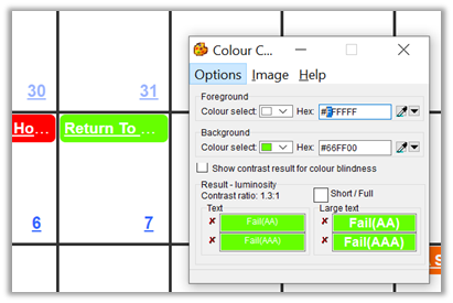
The white text on a lime green is very difficult for even me to read and I do not have any color contrast vision issues (that I know of.) But the tool tells me that the contrast is only 1.3:1. This is extremely low as white text on a white background is the base comparison and has a ratio of 1:1.
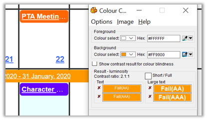
Other color contrast issues may not be as obvious. Take for example the commonly used white on orange within the district (because we are Orange County?). In this case, the contrast ratio is a little better, but it is still only 2.1:1 which according to ADA rules is not even sufficient for large text.
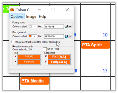
In some cases, I might never have guessed that the color contrast was not sufficient because it is close to the borderline of what is acceptable for larger and/or bolded text. The following example shows a darker orange that just falls under the 3:1 ratio needed for larger text.
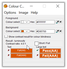
In all three of these cases, the colors used fail the contrast ratio test and must be replaced with other colors. How can you do that? Color contrast can help you. By clicking on the dropdown arrow next to the Colour selected field, a dialog appears that shows different shades/tints of the current color in two rows across the bottom of the dialog. The leftmost box in the first row is the current color, which in this case has the Hex value of #FF6600. The rest of the colors on this row add white to create ‘lighter’ shades. However, because we want ‘darker’ shades, we must drop down to the second row. The leftmost box in the second row has a hex value of #D95700.
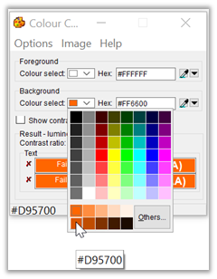
If you were to use this shade of dark orange, the contrast improves to 4.0:1 which may be fine for the calendar because it is a bolded text that may be large enough
To be really sure that the color contrast is sufficient, you could choose the second box from the left which has a hex value of #C04D00 and provides a contrast ratio of 4.9:1.

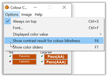
Even after finding a color that meets or exceeds the color contrast value for the font size and style you are using, you can also perform one additional check. The Colour Contrast tool I’ve shown here has an option to let you see the color contrast ratios of the three most common forms of color blindness. To switch to this view, open the Options dialog:
Using the last color selected above (#C04D00) which provides a contrast ratio of 4.9:1, we can see what the color contrast ratio might be for people with different types of color blindness.
Color blindness, also known as color vision deficiency, is the decreased ability to see color or differences in color. Simple tasks such as selecting ripe fruit, choosing clothing, and reading traffic lights can be more challenging. Color blindness may also make some educational activities more difficult. However, problems are generally minor, and most people find that they can adapt. People with total color blindness (achromatopsia) may also have decreased visual acuity and be uncomfortable in bright environments.
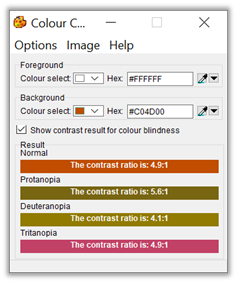
Note that in this case, people with Deuteranopia color blindness still have a problem with this color as it provides a ratio of only 4.1:1 to them. This means you may need to go even darker.
Deuteranopia is a type of color blindness more commonly known as red-green color blindness. People with this condition have difficulty distinguishing between shades of green and shades of red
Unfortunately, in the case of the calendar titles, you do not have the option of making the text white for some cells and black for other cells which would give you more options for color selection.
Anyway, I hope this helps.