
AIn this post, I’ll take a look at how to use alt text for functional images. But first, what is a functional image and how does it differ from an informative image previously discussed.
Essentially the difference is that a functional image initiates an action rather than just conveying information. As a result, functional images are often associated with buttons, links, and other interactive elements. Because clicking on a functional image implies an action of some type, the alt text typically identifies the action that occurs upon clicking on the image rather than a description of the image. For example, if you can click on the image of the OCPS logo on a page and by doing so it takes you to the home page of the OCPS website, the alt text should say something like “Open the OCPS home page” rather than “OCPS Logo.”
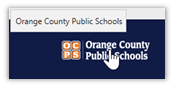
For example, the OCPS Logo in the bottom left of the OCPS home page is not a link and is there identified as a logo in the alt text.
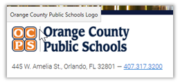
On the other hand, the OCPS logo found in the bottom right of every school web page is actually a link back to OCPS and therefore the alt text is simply Orange County Public Schools, where clicking the link takes you.
(Note: it is not required to say “Open the…” at the beginning of a functional image, although I believe that it makes the intent of the link clearer.)
In this case of a functional image, missing the alt text entirely or using the alt=”” empty text string could imply to a screen reader user that no action is associated with the image or even that the image is simply a decoration on the page.
Types of Functional Images
Image used alone as a linked logo
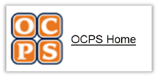
Suppose we placed the OCPS logo on a webpage inside a link to the OCPS home page. This would be an example of an image used by itself as a linked logo or a linked image. The fact that it is inside a link makes it a functional image as opposed to decoration.

The code related to this image might be something like:
<a href=https://www.ocps.net/><img src="ocps.png" alt="OCPS Home"></a>
You could say that this image appears on the page merely to provide an image to click on to go somewhere rather than displaying words alone that describe the link destination. Those words though typically define the alt text for the image. Here is what the text link would look like.
<a href=https://www.ocps.net/>OCPS Home</a>
Logo Images within link text.
It is possible to combine the above examples into a single link that includes both the image and the link text. In that case, the image could have a null value for the alt text to avoid repeating the same information as the link text.
<a href=https://www.ocps.net/><img src="ocps.png" alt="">OCPS Home</a>
Icon Images conveying additional information within the link text
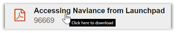
This example, taken from the document container, shows that the image in front of each document container’s filename provides additional information to identify the file type. Although the alt text used for the link tells us only that clicking on the link will download the file, perhaps it would have been better to say, “Click here to download the PDF file. However, due to restrictions in the way the document container was built, the flexibility to change the alt text depending on the file type does not exist. In any case, the icon image conveys that additional information within the link text.
Stand-alone icon images that have a function
Most of the district web pages have a search feature typically at the top of the page. This image often occurs together with a text box that allows the user to enter a text string they want to search for and a ‘magnifying glass’ icon. Most users recognize the magnifying icon is associated with searching the page or site for the text entered into the text box. Note that both the text box for the search string and the magnifying glass icon are part of the web page, not part of a form, nor is the magnifying glass part of another object like a button as is described next.

In this case, you can see that the alt text consists of just the word ‘Search’. This single word adequately defines the purpose of the button. Other examples of standalone images are those used to take the user to the district or school social media sites as shown in this image.

Images used in a buttons
When building a form that the user must interact with, such as a calendar, buttons often initiate actions such as displaying the prior or next month. Rather than placing text in the button that would have to change for each month displayed, simple images on the buttons help most people immediately understand that these images are used to navigate through the months such as these buttons which appear on the calendar page:
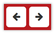
The code used to add these buttons to a form might appear as something like:
<input type="image" src="PriorButton.png" alt="Prior Month"><input type="image" src="NextButton.png" alt="Prior Month">
Note that the alt text in these examples define what happens when the buttons are clicked, not that the buttons contain left or right-pointing arrows.
Summary
Fundamentally, almost every case where a functional image is used, the alt text describes what the action will do whether that is to open a home page to a site, begin a search, switch to a prior month, etc. In each case, the alt text identifies an action, not the image. Only in the case where the functional image is combined with link text can the alt text be set to a null string.
Well, that’s all I have to say about functional images. Next time I will discuss the use of images of text and why that may not be your preferred choice for displaying that information.
Return to the beginning of the Alt Text Series