

First, let me be clear that accessibility is for everyone, not just the visually impaired. Some aspects of accessibility are directed toward those who have reasonably good vision or hearing and are meant to make documents easier to understand. Other aspects are directed toward users who need to use screen readers for documents and web pages. Therefore, you might say that in general, accessibility is for everyone.
While we can limit the use of fonts and even colors when creating your web pages, we have less control over the creation of PDFs from Word, Excel, or PowerPoint documents. However, the rules of accessibility still apply. Beginning with this post I will explore with you the ways that Microsoft Office products can help you create accessible Office files that can then be converted into accessible PDF files.
Fonts
In past posts, I have discussed the need for accessible text and color on web pages. Understanding what makes regular text easy to read by sighted people is not quite the same as what is needed for screen readers. For example, screen readers can actually read white text on a white background that the rest of us cannot see. It can also read text with practically any font, even script style fonts. This is because it reads the text from the page code. It is not an OCR (Optical Character Reader) This is also why text embedded in an image cannot be read by screen readers even though you may not have trouble reading it. So, accessibility in the case of visual readers comes down to a different criteria that text must use common non-decorative fonts. By common, I mean fonts that generally available on most computers, laptops, tablets, and phones. This generally means starting with a font like:
- Arial
- Book Antigua
- Calibri
- Georgia
- Tahoma
- Times New Roman
- Trebuchet MS
- Verdana
This is not an all-inclusive list, but you want to avoid fonts that are decorative (like Comic Sans Serif, Fonte, Old English Text, and others), script, or handwriting (like Bradley Hand, Segoe Script, or Lucida Handwriting).
Color Contrast
Color contrast between the text and the background is also something that affects mostly the accessibility of the document for visual readers. Color contrast must be sufficient to easily read the characters. White text on a white background clearly has no contrast. Contrast is represented by a number ratio from 1.0:1 read as 1.0 to 1 (no contrast) to 21.0:1 (white on black). I do not expect you to know how to calculate this ratio, just how to determine and interpret it. A simple way to determine the contrast ratio is to use a free tool like Colour Contrast Analyzer. To download your own copy of this useful tool, click on this link which opens in a new window to the Paciello Group site. This program also determines the effective color contrast ratios for the three major types of color blindness. Remember that color contrast has no meaning to a blind person.
(https://developer.paciellogroup.com/resources/contrastanalyser/)

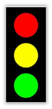 When you want to emphasize text, do not use color alone as those with color blindness may or may not be able to distinguish the difference between the colors you select. For example, people with red-green color blindness may not be able to distinguish which light is ‘lit’ on dashboards using a traffic light style indicator for KPIs (Indicators) as shown on the left. Rather, they use a combination of color and shape as shown on the right.
Similarly, when dealing with text, color alone may not be adequate to make the the text in question stand out from the surrounding text and therefore important text needs to be emphasized with a bold or italic style as well as by color. Keep in mind however that using ALL CAPS is the equivalent of yelling at your reader and underlining text may mislead your reading into thinking that the text is a hyperlink.
Accessibility applies to web pages and PDF files that you may want to make available through your web sites and might be viewed on a computer screen. Fortunately, Microsoft Office makes it relatively easy to create your content in a program such as Microsoft Word and by following some additional rules in addition to what was mentioned above, create accessible PDF files. Over the next several posts, I will explore various techniques when creating Word documents that will result in an accessible document. Today, I will begin with one, the proper use of header and paragraph styles.
First, remember that you never want to publish a Microsoft Office document (or a Google document or any other source document) on a public web site because not all site visitors who may want to download and read that document may have the proper application to open and display it. Therefore, the Internet standard is to convert a document to a PDF file and publish that document if it cannot be published as a standard HTML web page.
Headers
Small documents do not need any special navigation aids as the user can easily scroll through the document to find the text they want. However, as documents grow, finding specific areas within the document becomes more challenging. Microsoft Word addresses this problem through the use of Heading styles. You can think of styles as a combination of text fonts, colors, sizes, etc. to display different blocks of text. Heading styles in Word can be found in the Styles group of the Home ribbon. Initially three heading styles are available beginning with Heading 1 followed by Heading 2 and Heading 3.
Heading 1 is typically the largest font size style and may have a color or other style feature (alignment, underline, italic, etc.) associated with it. Each subsequent style usually gets a bit smaller. Think of heading styles as defining levels in an outline of your document. Heading 1 is typically reserved for the document title. You would then use Heading 2 for major headings or text areas within the document and perhaps even use Heading 3 for subheadings.
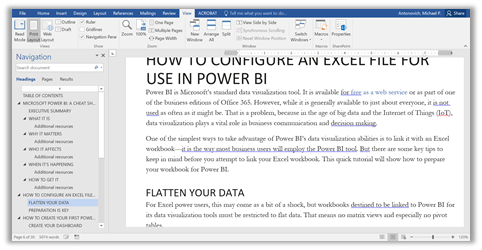
To navigate through the document containing headings, load the document and open the View ribbon and click on Navigation Pane in the Show group. This displays a panel on the left side of the document with the heading text. You can quickly navigate to any part of the document by clicking on one of the headings. You can also use the Heading styles to autogenerate a Table of Contents.
As you may have already guessed, this is a great benefit not only to help blind users locate the part of the document they are interested in, but also a great help to those of use who are visual readers. This is an example of accessibility for everyone.
Blank Spaces and Paragraph Styles
In some documents, you may be tempted to added several blank lines to visually separate one block of text from another. However, for those users of Screen Readers, encountering a series of blank spaces or blank lines (otherwise known as white space) may trick them into thinking that they have arrived at the end of the document.
A better approach is to use the paragraph style for either the paragraph before the start of a blank section or the following paragraph after a blank section to 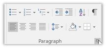 change the paragraph settings. The Paragraph settings can be found on the Home ribbon in the Paragraph group. Locate the small box to the right of the group name in the lower right corner.
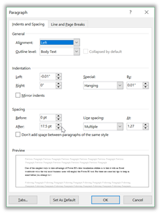
When you click on that box, the paragraph settings dialog opens. Notice in the following image, you can change the paragraph alignment, indentation, and spacing. Use the spacing options to effectively add extra blank space before or after the selected paragraph rather than using blank lines.
There is much more to cover about making a document accessible than what I have covered here. However, those topics will be covered in future posts over the next few days. In the meantime, try using headings not as formatting to a document, but to define navigation through the document. Also experiment with paragraph settings to see how they affect the appearance of text in your document.
Next time, I will take a look at images and the requirement to describe those images using Alt-text.