

In the past, we have run Google Analytics which told us that the majority of the web sessions on the OCPS portal were coming from desktop computers. In fact the number was as high as 95% in recent months. However, that does not tell the whole story. I recently extracted the most recent month’s worth of session data by device type and was able to group and summarize the data by domain. In other words, I was able to get the total count of sessions by device type for each school as well as for the overall Internet and the overall intranet. When looking at these totals by school, I was able to determine that there is quite a difference between district web access and school access. In fact, desktop sessions accounted for 97% of all Internet usage and 88% of all intranet usage. However, for most schools, the most common device type used to open sessions on our school sites were mobile devices. Mobile devices actually accounted for between 11.5% and 79.5% of all sessions on our school sites with an average of 51.03% and a median of 52.38%. But what does that mean to you?
It means that you have to place more attention on what your web pages look like on mobile devices. Especially important are whether images or tables are cropped off or require the user to horizontally scroll which nobody likes to do. So how can you tell what your page looks like on a mobile device? With the most recent update to our SchoolMessenger portal platform, checking your site’s appearance on different device formats is as easy as a click of a button, a button that is in the menu bar of all site editors. Just look for the icon that looks like a screen as shown in the following image:

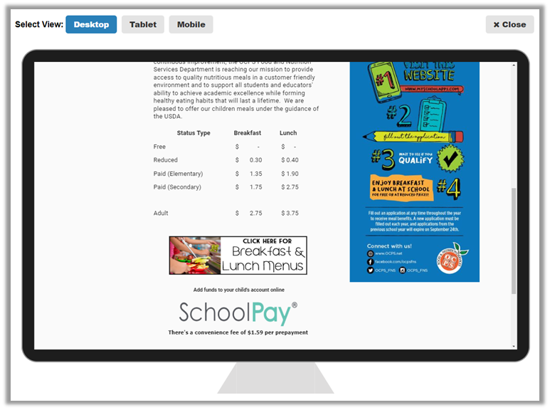
Click this icon after navigating to any of your site pages to show the page first in a simulation of a desktop monitor as shown below:
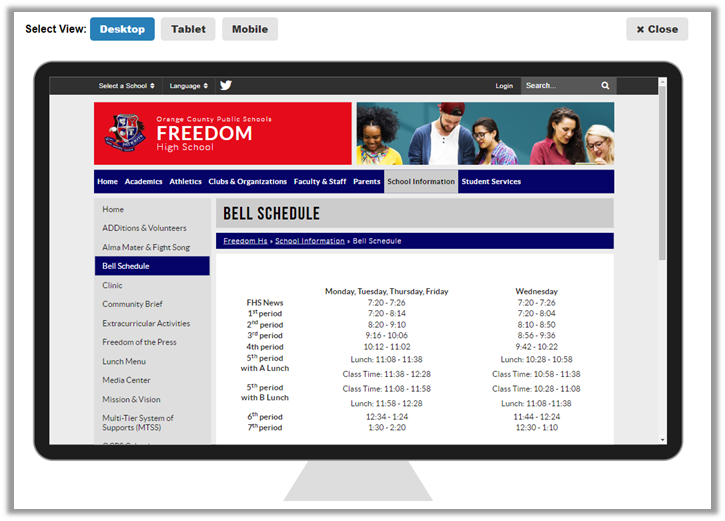
This is a fairly typical page that uses a table to display data. When I switch to mobile mode by clicking the Mobile button, the page looks like the following image:
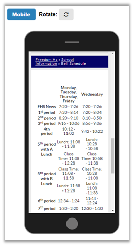
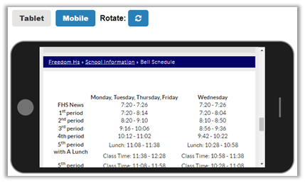
Still readable although the wrapping of the text make it a little harder to know what belongs in each row. A simple rotation of the device however (by clicking the Rotate button at the top of your screen while in edit mode), shows the table is fairly easily read.
On the other hand, suppose you have a page that has larger graphics or a table that was not created within the SchoolMessenger platform so that it is not resizeable, (perhaps it was copied from Microsoft Word). In this case notice that the table in the following image only has breakfast prices and that part of the image below the table is truncated.
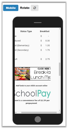
Here is what the page looks like on a desktop screen.
As you can see, it easy to lose important information if you do not test your pages first using this new feature in your editor’s toolbar. By the way, this second example was from an Internet page, showing that it is not just school web site editors that need to pay attention to how their pages render on mobile devices.
In subsequent posts, I will talk about specific techniques to insure that your pages display well on desktop and mobile devices so that everyone can see all of the information that you want them to view.