I’ve noticed two trends which school web editors should address as soon as possible. I will cover one this time and one next time. Today I would like to look at the use of colors on calendars.
However, before we get into colors, I want to make mention that many schools have failed to populate their school calendars with the major events for the year. While I understand that many events for this school year have been uncertain at best due to the COVID-19 impact on our lives, some events, especially most district level events such as the start and end of each marking period, school and national holidays, and other events were fixed by the district at the start of the school year. These can be found on the District 2020-2021 School Calendar page. These major dates should also be incorporated into your school calendars as well.
When adding an event to your individual calendars, the default color is defined as the template color used to display the calendar page itself. This is perfectly acceptable and should in all cases meet the ADA color contrast requirements. (If it does not, please notify me so I can work with SchoolMessenger to update the template used by the calendar pages.) However, some editors prefer to define different colors for various classes of events. Again, this is perfectly acceptable so long as the colors chosen meet the ADA color contrast requirement of a 4.5:1 contrast. This, however, is where the problem sometimes occurs. Let’s see why.
When you define a calendar event, the dialog that appears has many properties similar to those found in Microsoft Outlook. Two of the properties however can lead to ADA issues, color and icon.

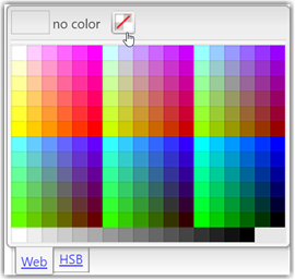
Let’s look at color first. It may appear that the default color is white. However, that is not the case. The default color is really transparent and will display the event using white text on a background color that matches the overall calendar color. If you were to open the dropdown for color by clicking the down pointing arrow, you would see the following dialog.

Note that on the top line, the dialog tells you that no color is selected. This means that the default calendar color is used. Beneath this top line is a two-tabbed color selection grid. The first grid with the tab name ‘Web’ shows web-safe colors. There was a time when not all browsers could display all colors reliably on a page. This had to due with the limited number of bits used to define all the colors on the page. Therefore, some colors were ‘approximated’ by dithering the colors that could be used. This is no longer the case with any modern web browser. Therefore, any color is acceptable. All colors consist of a combination of RED, GREEN, and BLUE. Each of these primary colors can be set to any numeric value from 0 to 255. The reason for this seemingly odd range is that each color is defined by 2 hexadecimal values which yields a maximum of 256 values including ‘0’. The combination of these three pairs of hexadecimal values for red, green, and blue can reasonably create any color. The second grid with the tab name ‘HSB’ (which stands for Hue, Saturation, Brightness) allows you to define over 16 million different possible colors.
Sounds great, right? Well, not so fast. You see all calendar events use white text and there are no options to change the text color. White text does not work on all 16 million background colors. In fact, many will not result in the 4.5:1 color contrast required by ADA. So even though these colors appear to be available and you in theory could select them, some may violate ADA requirements, even many of the colors in the so-called web-safe color grid. Remember that web-safe means something entirely different than ADA compliant when white text is applied over top of the background color.
Therefore, it is essential that you validate the background color you want to use against white text before you use it with a color contrast tool. There are many color contrast tools available on the Internet, but the one I, and many other professionals prefer, is the one found on the Paciello Group website known as the Colour Contrast Analyser. This is a free download with no intrusive advertising. It displays as a relatively small window on the screen. In fact, I keep it open at all times while working on the district’s websites.
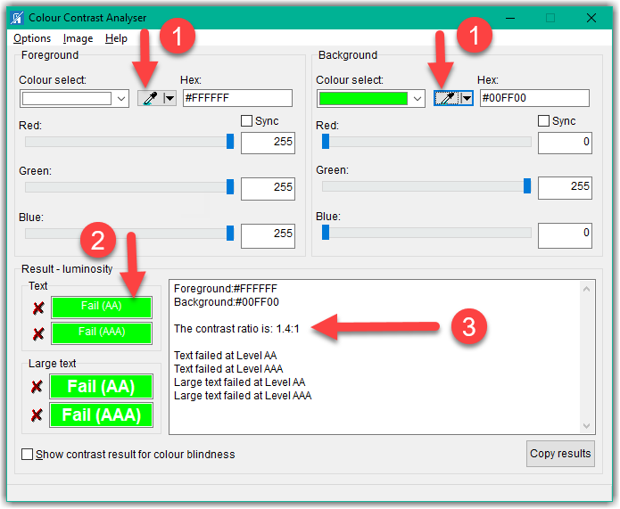
With your website open and the Colour Contrast Analyser open, you can use the ‘eye droppers’ from the tool to sample the font and background color of any portion of the screen. For the purpose of calculating the contrast ratio, it does not matter which color you sample as the foreground and which you sample as the background. The resulting ratio is exactly the same. You can also manually enter colors as well. Therefore, for white, the default calendar text color, I simply enter either the hex value of #FFFFFF or the decimal values of 255 for each of the three colors: red, green, and blue. See step 1 in the image below.
After selecting the colors for the foreground and background (remember it does not matter which is which), you can see what the color combination looks like in step 2 of the image below.
Finally, Step 3 shows the calculated contrast ratio. The rule is that the color contrast must 3:1 for bold text that is 14 pt or regular text that is 18 pt or larger (see my previous blog post that compares pt and px sizes) and a ratio of 4.5:1 for all other text. The calendar event information falls into this latter category. As you can see in this example, white text on a ‘lime’ green background only has a color contrast ratio of 1.4:1, far too low to be used. Thus, even though it may be a web-safe color, it is not a ADA compliant color when white text is placed on it.

Monsido can flag ‘suspicious’ colors and if I identify calendar events with insufficient color contrast, I may simply revert the background color to the default color to bring the calendar page back into ADA compliance.
The second item in the first image of this post gives you the ability to associate an icon with the event. While that may seem like a cool option, it may not be ADA compliant. It could be defined as decorative, which it undoubtedly is, but that would require setting the alt-text to a null string (alt=””). There also could be a default alt text associated with the icon or perhaps even an option that allows the user to define the alt-text. Until this happens though, avoid using the icon with your calendar events.
One last comment about the calendar and why it is important to your school. The OCPS mobile app pulls the calendar events from each school calendar to display when a user selects one or more schools to follow. Obviously, a parent is usually only interested in the events at the school(s) where they have children attending. They don’t really care about all of the other 190+ schools in the district. If you do not include upcoming events in your school calendar, don’t be surprised if parents don’t attend any of your special events.
Next time, I’m going to talk about the What’s News portlet which should be on your school’s home page on the lower left side.

