

In today’s post, I want to talk a little about style when creating links on a web page. More specifically, I want to talk about how style changes based on the type of medium used to display the link. For example, there is a huge difference between a printed document or poster that needs to display a link to another site and a link on a web page that displays a link to another page, document or website. The question revolves around whether to display the actual link or not.
Of course, when you have printed material, there is no question about displaying the actual link. After all, it is not possible to click on a poster or a printed document to go to the link destination. That is just silly. However, on a web page, one must ask whether the visitor to the site really needs to see or even cares about the actual link. Perhaps all they need is a short text string that informs them of where clicking on the link will take them. This is a different, but critical mindset difference.
For example, suppose you had a table such as the one shown below:
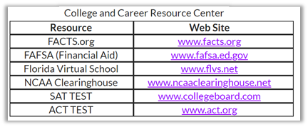
This basic table shows college and career resources as defined by the table caption. If you printed this table in a document or a poster, having the two separate columns, one with the name of the resource and one with the web site address of that resource would absolutely be necessary. However, when you think of looking at this information on a web page, you might have a different perspective. If you reexamine this table from a web page point of view, you might think that the name of the resource on the left is the key piece of information that you need to zero in on when determining if you want to learn more about that resource. The path to that web site on the right might even seem redundant because you would never write it down. Rather you would prefer simply to click on the resource name that you want such as shown in the image below.
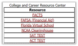
Now it is easy for the website visitor simply to identify the resource they are interested in and click on it to go to that resource. They typically do not care about the actual URL of that resource.
However, you might take it a step further. Why create a table of a single column? Is not a table of a single column simply a list? So why not just create a list like the following to display the resource links.
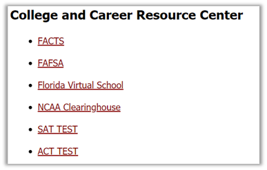
There are advantages to displaying the information that once was in a table as a list.
A list is easier to maintain, to insert new items alphabetically, to delete resources that no longer exist, or even to edit the name of the resource or URL.
A list is easier to meet ADA requirements. In fact, other than the standard color contrast requirements for links which apply no matter where a link is displayed, and the need for the link text to be meaningful when read out of context, the only new ADA requirement might be to ensure that the links incorporate some additional vertical spacing. In this example, I double-spaced the links so that users with issues related to using a mouse can more easily click on the link they want.
In fact, this change eliminates all table related ADA requirements while making it easy to change to the way you display the data and how visitors to your site consume the data. It also makes the site look cleaner.
The detractors of this method might argue that by ‘hiding’ the URL, the user does not know if the URL is safe to click on. I am sorry to burst that bubble, but just because the visual link looks safe, the actual link can be entirely different from the one displayed. In fact, that is how many phishing scams get people to click on links that take them to other sites where the bad guys can prompt the user for additional personal information. If a user really wants the URL of the site, they can always hover over the link and most browsers will display the URL in the bottom left corner. Of course, if they click on the link, the URL also appears in the address bar at the top of their browser.
Till next time, remember that style matters.