

I am not talking about the fact that it is summertime in Florida or how you feel when you lose electricity due to a storm and your air conditioning does not work. No, I am talking about the OCPS websites and whether they are ready for the start of a new school year. I understand that lots of things are heating up at this time of year as you and your department or school gets ready for the new school year, but don’t forget that now is the time to make sure your web pages are ready for parents and students getting ready to go back to school. With that in mind, I created a list of 20 things you should consider concerning your web pages as we approach the start of a new school year. These are not cool.
- Abbreviations that the public may not know or may misinterpret unless you define them first. For example, when I talk about ADA, I’m not talking about the American Dental Association, but the Americans with Disabilities Act which we must follow.
- A large amount of text added to images or scanned documents in which the text is not repeated in the Alt-text means absolutely nothing to the blind and the visually impaired that rely on screen readers to access the your website. Help them access all of your content. It’s not just the right thing to do, but it’s the law.
- If you have a school that has no recent news, no calendar events, and no content under academics, what are you telling the public about your school? Yes, there is Facebook and Twitter feeds, but those are more for instantaneous notification, not historical, background, or planning information. By the way, if you do not have calendar events on your site, how will students know when to return to school?
- A principal’s message on the home page should be a place for a principal to brag about why someone thinking of moving into the area should select their school instead of the one down the street. A message that just repeats other content like basic school information that appears on the School Information page, or echoes other event announcements that appear elsewhere, or without it being a personal message might imply to an outsider that the principal is not enthusiastic about their school. Oh, and by the way, including the principal’s name and photo would be nice.
- Outdated content on pages. This is pretty big because while some content is clearly outdated such as when it includes the year and that year is obviously in the past (like the page that listed report card and progress report dates from 2009), sometimes the content does not contain the year. Only by looking at when the page was last updated or looking at a calendar and discovering the date falls on a weekend can this be discovered. I have even seen pages that reference people/staff who are no longer with OCPS.
- Pages that say ‘Coming soon’ for months. This is like the sign down the street from us for a new Publix that has said ‘Coming Soon’ for the last year. While they have finally broken ground, the real estimate for completion is not until spring (they did not say which year). I do not call that coming soon. Any neither should you be satisfied with pages that say coming soon for months. Keep pages with no or unfinished content hidden until you have added the information that makes the page meaningful to the public.
- Broken links. Even if the link is valid the day you create the page, that page could be deleted, renamed, or moved at any time. Periodically, check the links on your site. At least use the Monsido weekly reports to identify broken links. With Monsido’s help, a broken link should not be out there for more than a week or two.
- Misspelled words. It does not matter whether you have a school site or a district site, misspelled words reflect poorly on the district. The Presence text editor, Microsoft Word, and the free tool Grammarly provide easy to use spell checkers.
- Use of all uppercase in a sentence or paragraph. On the web, this formatting indicates that you are yelling at the person. Are you really?
- Use of multiple font styles on a page (or perhaps throughout a site) looks very unprofessional. There may be a few legitimate cases where a different font style is called for such as when including program code in a page using Courier New or for purposes of highlighting a quote. However, just to use different font style for each paragraph looks like you cut and pasted the content without concern for how it looks or perhaps you previously worked making carnival posters.
-
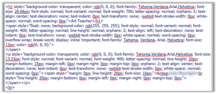
Copy and pasting content from another text editor other than Presence without using the Paste Plain Text option leaves a lot of miscellaneous and unnecessary HTML code on a page. This excess baggage makes it difficult for those who follow you to maintain the content. For example, I found a page that looked like this:
When all that was really needed was:

- Copy and Pasting an image rather than uploading the image file also inserts the binary equivalent of the image in the text area making it harder to locate the actual page text and may make it difficult to manage the ADA requirements. (Remember, ADA refers to the Americans with Disabilities Act?)
- Using tables to format content on pages. First, tables have special ADA requirements, which typically are not followed even where tables are appropriate. Second, tables, especially wide tables, may not resize when different devices (desktop computers, tablets, and phones) are used to access a page. This could result in truncating content off the right side of the device’s screen.
- Using heading tags simply to format text rather than to define content areas. Headings define content sections. Think of outlines. In fact, that is how screen readers treat headings for the visually impaired, reading to them an outline of the page and allowing them to jump to the content they are interested in rather than hearing the entire page’s content.
- Using the Heading 1 (<h1>) tag in any page content. ADA rules state that there can only be one Heading 1 tag on a site and that by default is the site home page. Think of it this way. A site must have a single root page from which all other pages branches. That is why multiple Heading 2 through Heading 6 tags are allowed but only a single Heading 1 tag is allowed.
- Combining different content topics on a single page makes it hard for the site visitor to find what they want based on the menu/page title alone. If a visitor cannot find the information they want by looking at the text in menus, they may simply assume that it is not there. They will not hunt through all the content pages to find buried content.
- Overwriting the colors of hyperlinks rather than using the default colors provided. First, this could result in insufficient contrast between the font color and the background color. Second, it interferes with the default behavior of links that change color or style when you hover over them and after you visited the link. Both issues are an ADA concern.
- Using underlining for anything other than a hyperlink confuses some visitors, at least momentarily, who expect underlined text to represent hyperlinks.
- Creating multiple pages on your site with the same content rather than creating it once and then redirecting the user to that single page from other menu locations using the External Link Page feature. Having multiple pages with the same content raises the risk that one page may be updated while another may not. Talk about confusing.
- Thinking that learning the rules of ADA for your web site and applying them does not apply to you. While many of the existing ADA issues on OCPS pages have been fixed by the district as part of their effort to assist Monsido and Presence clearly represent the real site issues that users must fix, managing your ADA issues is now your responsibility.